The July 2012 State Employment statistics show a never ending bleak picture for the U.S. worker. Forty-four states saw their unemployment rates increase and nineteen states show their payrolls shrank from June 2012.
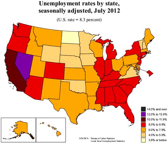
The national average unemployment rate is 8.3%. Yet from the above map, we can see some states unemployment rates just don't really budge. Nevada still has the highest unemployment rate, at 12.0%. Rhode Island came in at 10.8%, California, 10.7%. Alaska and Alabama show their unemployment rates increased 0.5% in a month.
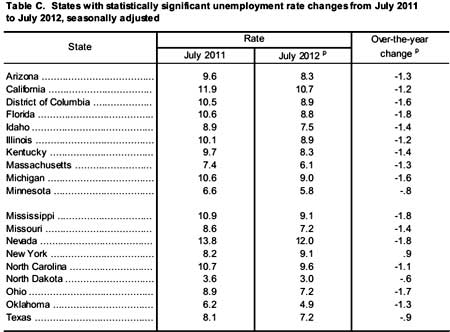
States with unemployment rates above 9.0% are New Jersey at 9.8%, North and South Carolina, both at 9.6%, New York, at 9.1%, and Georgia at 9.3%. Below is the table of significant unemployment rate changes from a year ago. While we can see some of the states with super high unemployment rates dropped, remember, people literally fall off of the count, without getting a job. Also, notice how short this list of significant change in unemployment rate from a year ago is.
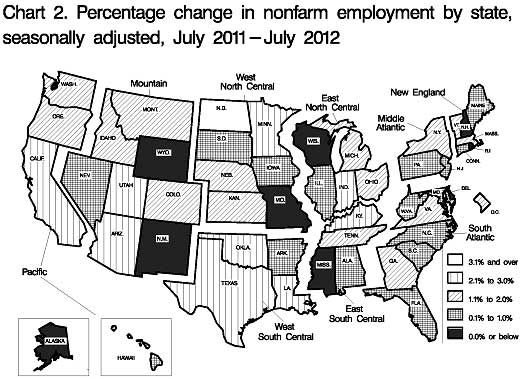
The monthly change in payrolls isn't so hot when one looks at the percentages. Remember California is the largest state by population followed by Texas. Almost 12% of America's population lives in California. From the actual statistics, once again, only North Dakota seems to really know how to employ people.
In July 2012, nonfarm payroll employment increased in 31 states and the District of Columbia and decreased in 19 states. The largest over-the-month increase in employment occurred in California (+25,200), followed by Michigan (+21,800) and Virginia (+21,300). The largest over-the-month decrease in employment occurred in New Jersey(-12,000), followed by Missouri (-7,700) and Illinois (-7,100).
Vermont experienced the largest over-the-month percentage increase in employment (+0.8 percent), followed by Virginia (+0.6 percent) and the District of Columbia, Hawaii, Kansas, and Michigan (+0.5 percent each). Alaska experienced the largest over-the-month percentage decline in employment (-1.0 percent), followed by Idaho, New Hampshire, and South Dakota (-0.4 percent each).
The change in actual jobs from a year ago is also weak considering how many unemployed, officially at 12.8 million, there actually are.
Over the year, nonfarm employment increased in 41 states and the District of Columbia and decreased in 9 states. The largest over-the-year percentage increase occurred in North Dakota (+6.8 percent), followed by California (+2.6 percent) and Oklahoma (+2.4 percent). The largest over-the-year percentage decrease in employment occurred in Rhode Island (-1.6 percent), followed by Wisconsin (-0.8 percent) and Alaska and Missouri (-0.5 percent each).
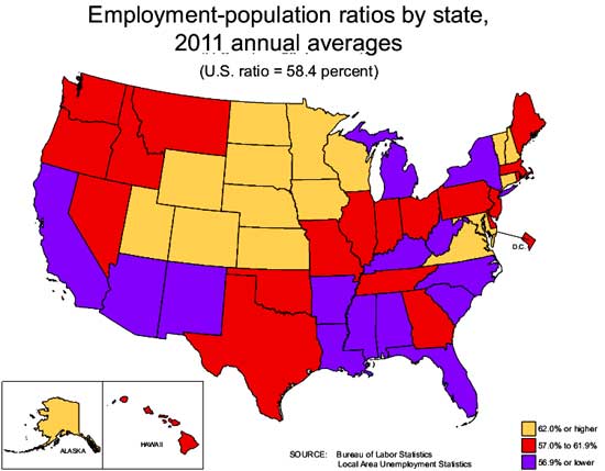
Employment to civilian non-institutional population ratios shows how many people have a job in comparison to the potential labor force pool. The employment to population ratios are at record lows. The reason can be an aging population, i.e. more retirees, but these days the ratio reflects how many have dropped out of the labor force. Notice how the below 2011 employment to population ratio state map correlates to the high unemployment map shown above.
Below is the metro area unemployment rates map for July 2012. Don't go to California, New York, Florida, Nevada or Chicago for that matter if you're looking for a job.
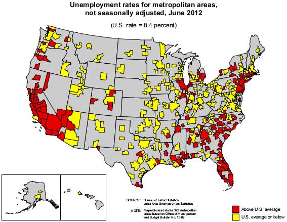
The Pacific region of the country has the highest unemployment rate, 10.0%. That's California, Oregon, Washington, Alaska and Hawaii. West North Central, which includes North Dakota, South Dakota, Minnesota, Iowa and Missouri had the lowest unemployment rate by region, 5.8%. North Dakota is the place to get a job, clearly, their unemployment rate is an astounding 3.0%.

New York increased in unemployment
For now, notice New York State increased their unemployment rate in the past year.
State Employment Maps are from the BLS
We didn't create these maps, they are provided by the BLS and anyone know of great mapping software, let us know, these are not really that adequate, but when looking at regional data, maps are the best way to illustrate what's going on.
you folks using these maps as an example of bad coloring levels
Complain to the BLS. They are their maps and frankly I'd love to find an easy way to create dynamic maps for economic data that did not look horrific and am considering new software to do so. These are the best of the lot one can get for economic mapping data and I agree, their color levels are from 2009. Sorry to give your exercise answer away. Good luck class.