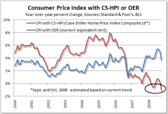
Tim Iacono of "The Mess that Greenspan Made" has published the latest version of his very revealing graph series of the Case Schiller-CPI, which replaces "owners equivalent rent" with actual house prices:

I consider this graph the best proxy available for measuring the competing forces of inflation and deflation. As Tim points out, the graph is now "screaming" deflation. Tim, however, doesn't think measuring deflation is particularly productive. Here I respectfully disagree, for reasons I discuss below.
Back when I was much younger and just starting to pay attention to markets and the economy, I wanted to review some basic relationships among economic variables. I realized that as a layperson and a newbie at that, I could not hope to match the knowledge of the pros. What I could do, I reasoned, was to try to obtain the lion's share of their wisdom that I could learn and make use of in the least amount of time.
One thing I did was to chart the relationship of the year over year performance of the Dow Jones Industrial Average, and compare it with the year over year inflation rate, going back nearly 100 years. It would be WAY too time-consuming to recreate that hand-written table here, but suffice it to say, there was indeed a correlation, that continues to hold true to this day.
I discovered that YoY changes in the DJIA correlated well with changes of at least 2% in the inflation rate. If the inflation rate increased by at least 2% YoY, from say 3% to 5%+ or from 8% to 10%+, the market over that same time almost always declined. Contrarily, if the inflation rate declined by the same percentage, the market advanced.
But the sample period included times of deflation as well, including the Great Depression. And here, the correlation was much more dramatic. The market correlated with a rate of deflation exactly as if it were the mirror image of inflation - squared. That is, (-1%) deflation = 1% inflation, (-2%) = 4%, (-3%) = 9%, and so on.
Put another way, the "sweet spot" for stock market performance was the range between (-1.4%) deflation and 2% inflation. Beyond that, even a small move from say (-1.4%) to (-2%) = a 2%+ rise in inflation.
(-1.5%) was the pivotal point. A smaller deflation might be benign, as lower consumer prices were not offset with lower wages or higher unemployment. A larger deflation meant a spiral of lower wages and expanding unemployment.
This same pivotal point was shown in the table I recently created of past deflationary recessions (which I have updated to include the Panic of 2008):
Recession dates/ YoY, monthly deflation/greatest +/- change
| Recession Time Period | -1.5% Deflation | Largest Change |
|---|---|---|
| 1/13 - 12/14 | 2 - 4/14 | (-3.0%) |
| 8/18 - 3/19 | n/a (inflationary) | +23.7% |
| 1/20 - 7/21 | 8/20 - 9/22 | (-15.8%) |
| 5/23 - 7/24 | 4/24 | (-1.8%) |
| 10/26 - 11/27 | 1 - 5, 8/27 | (-3.4%) |
| n/a | 6/28 | (-2.8%) |
| 8/29 - 3/33 | 4/29, 3/30 - 8/33 | (-10.7%) |
| 5/37 - 6/38 | 1 - 12/38 | (-3.4%) |
| 2/45 - 10/45 | n/a (inflationary) | +2.8% |
| 11/49 - 10/49 | 1/49 - 1/50 | (-3.2%) |
| 7/53 - 5/54 | n/a | (-.8%) | 12/07? - ???? | 10/08 - ???? | (-1.5%) |
That is why I respectfully disagree with Tim Iacono, and believe the (-1.5%) deflation of the last 3 months is a watershed. Viewed in this light, it is probably not a surprise that the stock market has crashed since this deflation has set in since July, and indeed appears to anticipate a much more crippling deflationary spiral.

Comments
Interesting. For what it's
Interesting. For what it's worth, a home price decline of 9 percent instead of 18 percent as indicated in my chart would produce year-over-year inflation of +1 percent instead of -1.5 percent.
Welcome to EP Tim!
If you want to, this is a community site. You can create an account and even blog on here and cross post (see user guide) if you want. Although your blog I think has more readers and we even RSS your writings.
When you have an account you don't have to deal with typing letters into little boxes, moderation queues and such.
That's interesting, what is the total deflation w/o home prices and then gas prices?