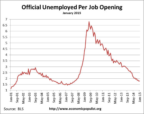
The BLS JOLTS report, or Job Openings and Labor Turnover Survey shows there are 1.8 official unemployed per job opening for January 2015. Job openings were around five million. Job openings returned to pre-recession levels while overall hires has also increased to pre-recession levels. In just the private sector job openings have also recovered to pre-recession levels while private hires are finally just 3.4% from their pre-recession levels. The U.S. is finally back to where we started from, all the way back to 2007.
There were 1.8 official unemployed persons per job opening at the start of the recession, December 2007. Below is the graph of the official unemployed per job opening, currently at 1.8 people per opening. Finally the U.S. returns to having enough job openings after years of terrible figures.
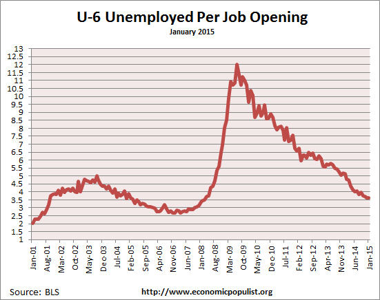
If one takes the U-6 broader measure of unemployment that includes people who are forced into part-time work and the marginally attached, the ratio is 3.6 people needing a job to each actual job opening. In December 2007 this ratio was 3.2. So here too we're finally seeing some good ratios regarding job openings.
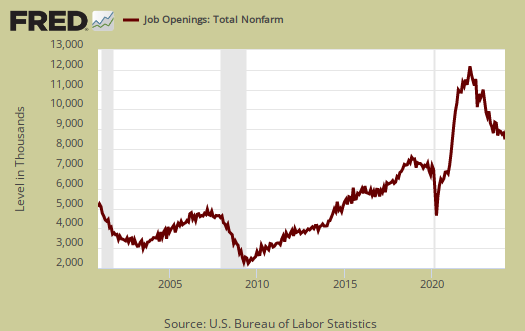
By either measure it is clear job openings have finally returned to pre-recession levels. Bear in mind there are more people needing a jobs when looking at the below raw job openings figures. Currently job openings stand at 4,998,000.
Since the June 2009 trough, actual hires per month have only increased 17.4%, but that's only because recession hiring really didn't crash and burn like firings and openings did, Total hires are finally at pre-recession levels, although by last month hires dropped -4.6%. In the private sector hires are about 3.4% below their pre-recession levels. Keep in mind the levels of working population have increased significantly since 2007. Additionally, Businesses can say there are job openings, but if they do not hire an American and fill it, that doesn't help the labor situation. Below is the graph of actual hires, currently 4,996,000.

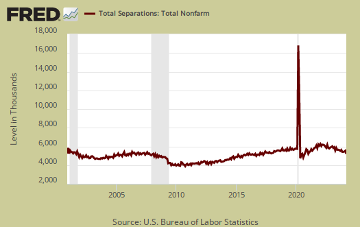
Graphed below are total job separations, currently at 4.821 million. The term separation means you're out of a job through a firing, layoff, quitting or retirement and is also called turnover.
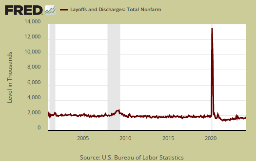
Layoffs and firings were 1.669 million, which has been fairly stable for some time, hovering around 1.7 million. Below is a graph of just layoffs and firings. One can see from labor flows businesses are not trashing their workforce like they did in past years. Labor flows means the way people are hired, stay at a job, quit, get fired, get another job and so on. It is the overall flow of the labor market for as people are get jobs, they also lose them.
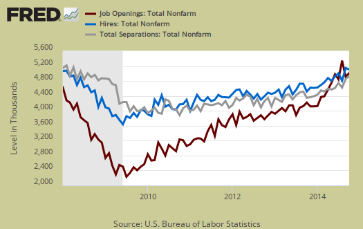
Graphed below are openings, separations and hires levels, so we can compare the types of labor flows. While layoffs have declined to pre-recession levels, it is the hires (blue) that needs to increase. The below figures also disprove a labor shortage. A labor shortage would imply more job openings than unemployed available to fill them.
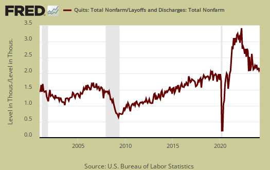
Graphed below are people who quit their jobs minus those who were fired and laid off. The lower the bar on the below graph, the worse labor conditions are. Workers quit their current jobs often to obtain better ones. People feeling free enough to leave their current positions is considered a positive labor market sign. Quits were 2.8 million. Quit statistics are now less than 1% below pre-recession levels of 2.9 million, a sign things are finally really improving. That said, who ever thought 2007 would be considered a hot year for job opportunities? The reality was...it wasn't.

Below is a graph of the quits to layoffs ratio, currently at 1.7. This ratio of people who quit their jobs vs. those who were fired gives an indicator of worker churn as well as if there might be a shortage. If the ratio is below 1.0, this means more people are being laid off and fired than people who quit. When the ratio is much higher, this means more people quit their jobs and thus implies there is better opportunity elsewhere and workers feel free enough to move on to obtain those new better jobs. The quits to fires ratio was 1.9 in 2006.
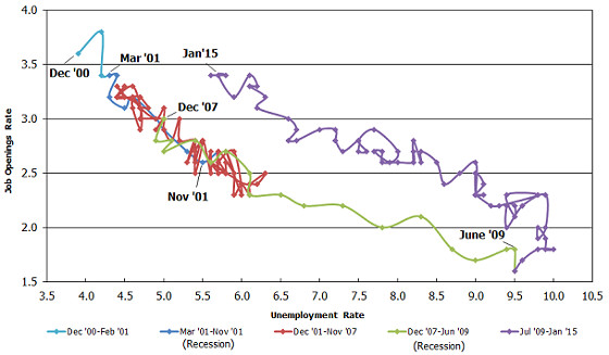
Another interesting graph is the BLS generated Beveridge Curve. The Beveridge curve shows the official unemployment rate vs. the job openings rate, over time. If you see a bunch of data points to the far right, that's bad, it means there is long term unemployment and not enough jobs. Up and left in the Beveridge curve is good, it means there are jobs, people are getting hired, life is good. A right and up move in the Beveridge curve can indicate a skills mismatch. The green, representing the 2009 time period, shows how fast we went to the right. The purple line is 2010-2015 still is finally back to the red line area, which was when the job market was deteriorating rapidly. The left upwards portion of the graph which would indicate a healthy job market. The red line, which wasn't that great of a labor market, is pre-recession. The reason the curve is higher than the red December 2007, pre-recession area is because the unemployment rate is higher than before the recession. Yet the graph shows things are finally really improved.
One of the best statistics from the JOLTS report is the net employment gain. For the year, there was a gain of 3.1 million employed. Bear in mind employment duration in so called permanent jobs these days is very low, so due to labor flows the net gain of jobs over time belies the monthly headline buzz of jobs gained. From the JOLTS report:
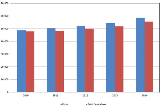
Over the 12 months ending in January 2015, hires totaled 59.1 million and separations totaled 56.0 million, yielding a net employment gain of 3.1 million. These figures include workers who may have been hired and separated more than once during the year.
Below is a BLS made graph showing the annual hires and separations since 2010. What one needs to notice is how separations have increased every year and this is when the U.S. had a mass jobs slaughter in 2009 where millions of people were fired. Doesn't this graph look like musical job chairs?
The bottom line is the situation is really getting back to before the great recession. The hidden element in these statistics is how long it has taken to return to 2007 levels. Another factor is the random culling of the labor force along the way. Remember population growth, including working age population has growth considerably since 2007. Finally, 2007 wasn't exactly the year of the worker, although 2000 might be said to be that year.
For the JOLTS report, the BLS creates some fairly useful graphs beyond the above and they have oodles of additional information in their databases, broken down by occupational area. That said, one doesn't know if the openings are quality jobs from the JOLTS statistics.
The JOLTS takes a random sampling of 16,000 businesses and derives their numbers from that. The survey also uses the CES, or current employment statistics, not the household survey as their base benchmark, although ratios are coming from the household survey, which gives the tally of unemployed.
The January 2015 unemployment rate was 5.7%. U-6 alternative unemployment rate was 11.3%. JOLTS includes part-time jobs and does not make a distinction between part-time, full-time openings. A job opening reported to the survey could literally be take out the trash twice a week and be counted. This is a shame, it would be nice to know a little more about the quality of these new opportunities. Here are our past JOLTS overviews, unrevised.

Cause of slow employment/middle class income growth
Three major consumer goods have dramatically improved the life of middle America over the last 100 years.The automobile plus its infrastructure plus the TV were easily measured by GDP. The auto increase employment dramatically and the TV increased employment some but production techniques cost dropped dramatically as did contribution to GDP and employment per unit of enjoyment. Then came the cell/smart phones. Consumer enjoyment was about as large as vehicles and TV's but cost was minimal and so was the increase in GDP and employment.
How do you measure the GDP of a smart phone. Its a phone, a TV, a tape recorder, a camera, a movie camera, a library.... Add the cost of said items in 1950's and 60's prices to today's GDP. How much income did it take to buy these items 50 years ago during the glory days of GDP and income growth. Now add the drop in cost phone call across the country to income. If you send a picture you need add the cost to GDP and income. Now adjust for quality. Color TV, Now estimate the value of all this being portable. The middle class has a lot more income than is being measured.
Major scientific accomplishments such as aspirin, penicillin and curing childhood diseases pile up and contribute to wellbeing but GDP and employment are minimally affected. Soon to come gene therapy. How can you measure making a blind person see?